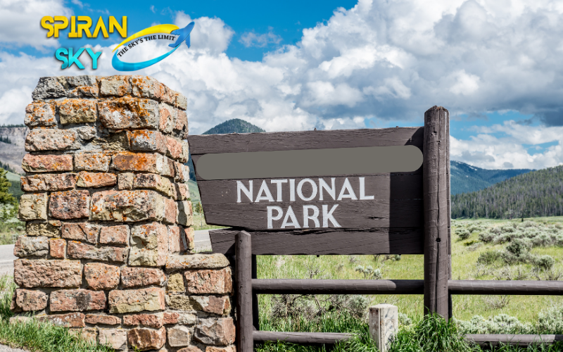
There are times when trail signs and the entrances to National Parks are as iconic as the parks themselves.
Color and font schemes used by the NPS to create some of the most noticeable elements of our favorite parks have always fascinated me.
My goal was primarily to investigate the places in which each of these elements originated in order to develop a style guide for those who want to emulate them.
Logo of National Parks Service
As a starting point, let’s look at the arrowhead logo of the National Parks Service. More than 70 years of history have been devoted to it!
There are arrowheads, sequoia trees, and mountains in the logo. These monuments are believed to symbolize the historical and natural heritage that is being preserved by the NPS.
We feel this is most likely accurate, but it has never been confirmed.
This logo design has been created by Aubrey Neasham, a historian in the West Coast areas of the United States, back in the 1950s, when he drew the original sketch.
An internal architect developed the current design based on the sketch provided by the new director in 1951.
A standard logo was designed for NPS publications and signage after the design was finalized.
Several changes have been made to the logo over the years. However, outside of the slight revisions made then, we see that the logo remained almost identical.
In 1968, Chermayeff & Geismar replaced the Arrowhead logo with a more stylized representation. The logo was updated once again in 2000.
It was decided to update and standardize the NPS style guide with a small Washington, DC design firm named Dennis|Konetzka|Design Group (DKDG).
We are still using what we created as a result of this process. The newest logo is available in two versions.
The logo in the first example is flat, while the logo in the second one is more like an image in three dimensions.
Colors of the National Parks.
According to our research, the only official colors for the national parks service are those used in their most recent logo. The following are some of them.
National Parks Fonts
The standard font for National Parks signage was Clarendon (serif) before the 1990s. A project was undertaken by the National Park Service in 2000 to standardize fonts across all their sites.
The font designer James Montalbano developed Rawlinson (serif) as a result of that project, which was adopted as NPS’s main font moving forward.
To complement Frutiger (sans serif), two distinctive and functional typefaces were paired with the NPS.
Here are some examples of official NPS fonts
There is no shortage of these typefaces in nature. These three examples show the entrances to Death Valley and the Grand Canyon, respectively, taken from Thunder Hole in Acadia.
The fonts on various National Parks Service signs are easy to spot once you know what they look like. The new standards set over 20 years ago are still not used on a lot of signs today.
Fonts that are not standard
There is no history of the NPS keeping all their signage the same. Until 1968, parks had the freedom to choose any font, color, or material they wanted.
However, this created a branding challenge for the service as well as contributed to the uniqueness of each park.
As an example of this, you can think of several iconic signs that you are familiar with today.
There is barely a discernible serif on the Yellowstone sign. We found Marcellus SC to be the closest match.
There is also a font used on Zion National Park’s sign that we are unable to locate. In our opinion, Stoke is the closest replica.
NPS signs that say “National Forest” also use a common font. All signs on National Forests and Monuments use this cursive font.
According to my research, the closest free font I could find to what they used here is Viber.
Finally, there are several national parks that use rounded fonts as a default format for their signs, such as Rainbow Point in Grand Canyon National Park, rounded in design.
There is something about this font that makes me think of the output that would be produced by a handheld router.
There are a few fonts I could find that is close to the one the NPS uses here, but you can view them both here or Patrick Hands to find out which one is as close as I could find.
Also Read: signs of national parks the complete guide


